PROJECT
Belgian Waffle Ride Brand Development
Belgian Waffle Ride Brand Development
WORK CATEGORY
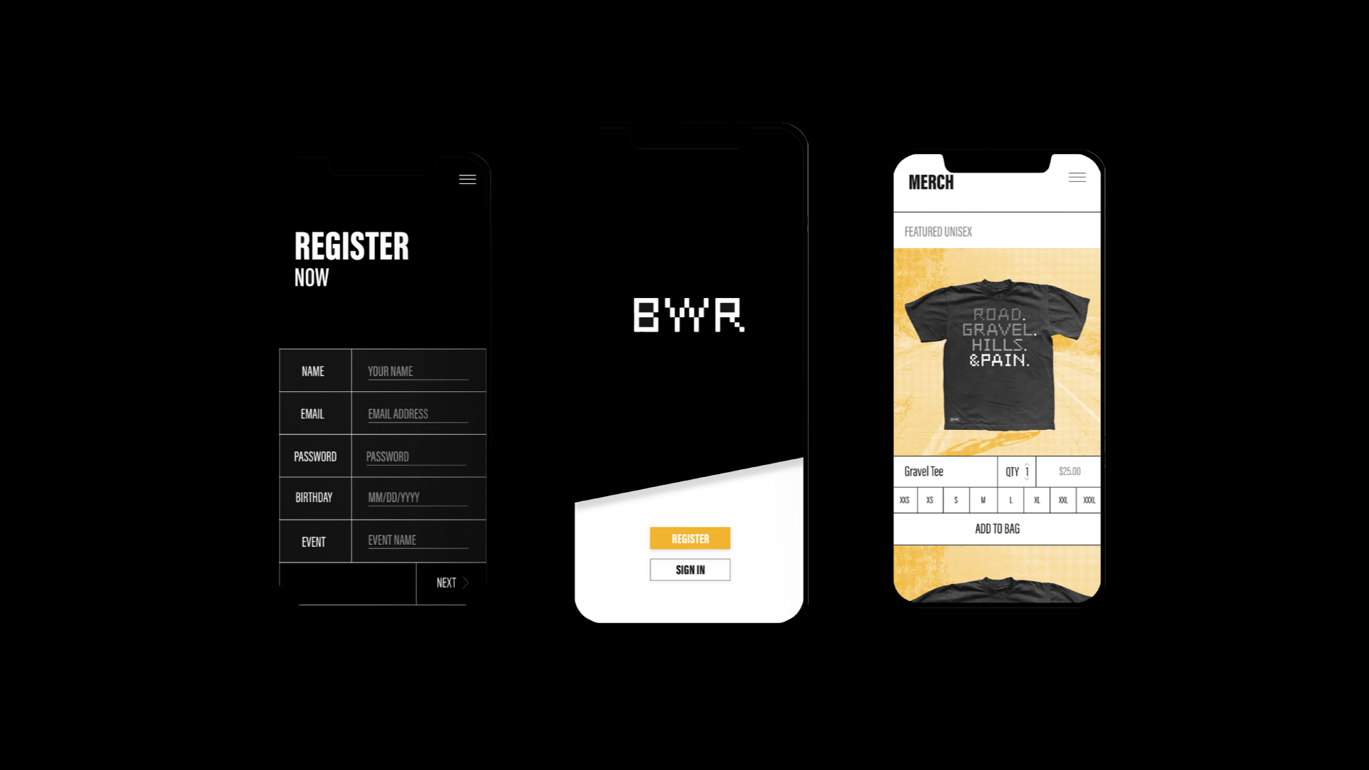
Art Direction, Brand Identity, App Design, Photo Editing, and Graphic Design
Art Direction, Brand Identity, App Design, Photo Editing, and Graphic Design
PROJECT DETAILS
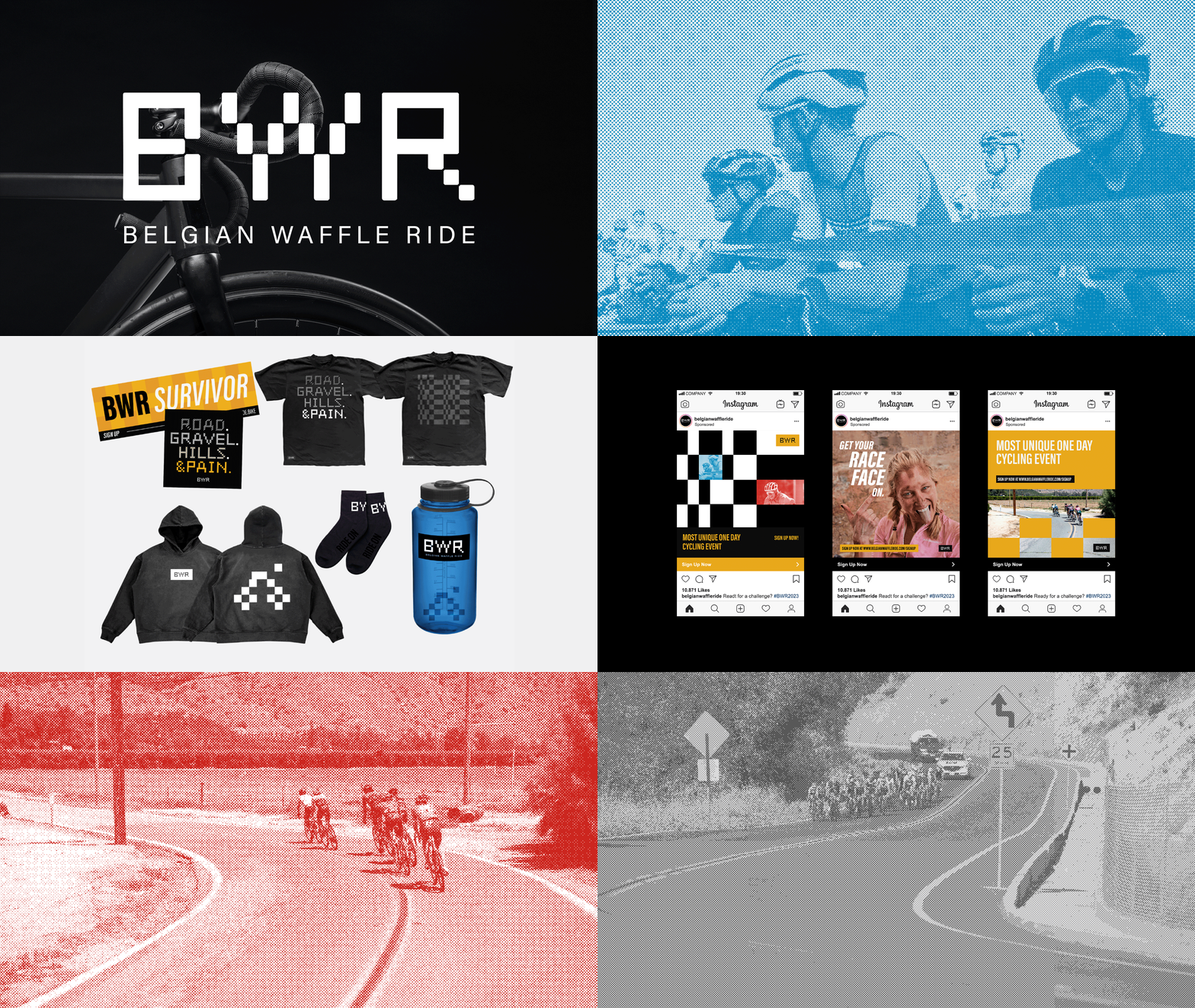
The logotype uses the display typeface Find Replace because it’s shapes resemble bike tire tracks. The goal was to create a visual brand identity that represented racing culture.
Belgian Waffle Ride (BWR) is a cycling event that blends different terrains in a singular challenging race.
BWR is known for it’s high energy and challenging atmosphere, it’s a race unlike no other. The approach for this visual brand identity was focused on the energetic racing atmosphere that BWR and racers cultivate.
BWR is known for it’s high energy and challenging atmosphere, it’s a race unlike no other. The approach for this visual brand identity was focused on the energetic racing atmosphere that BWR and racers cultivate.
The logotype uses the display typeface Find Replace because it’s shapes resemble bike tire tracks. The goal was to create a visual brand identity that represented racing culture.
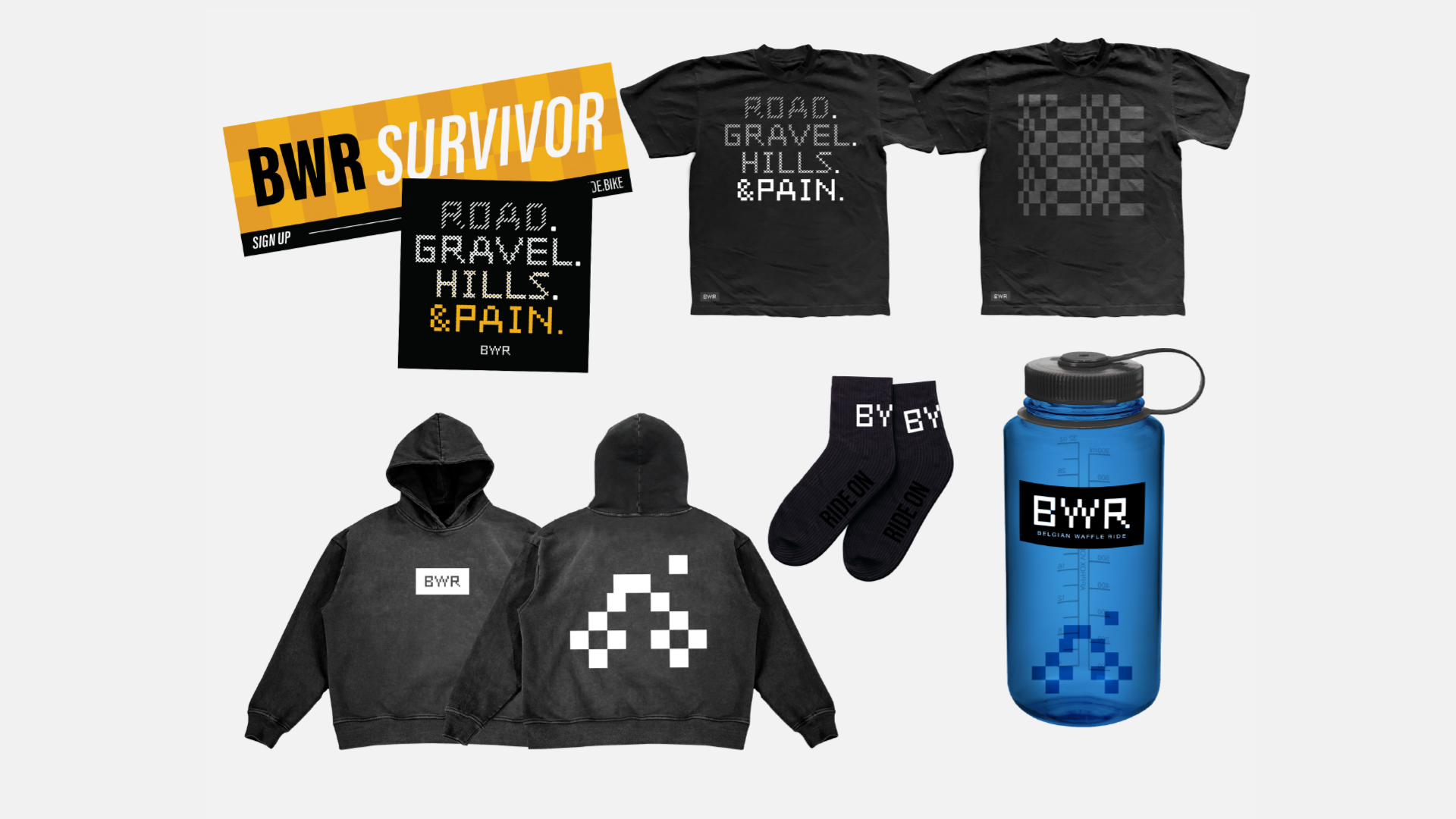
We took the checkered elements and bike tire track elements of the logo and pushed them further across the different elements of the branding. We then distorted the original checkerboard patterns across merch and digital ads, emulating speed and high energy through the checkered prints.


